Posts

Scar Tissue Narrative Interactive Story Video game presentation at Dames Making Games, Tanya Kan and Mikki Benaglia

While buried with other work obligations, I was really pleased to have the chance to work with some really talented people at this year’s TOJam 9, the largest game jam in Toronto. For the uninitiated, it means that participants in teams of their choosing have 48 hours the weekend of April 25 to 27 to create a game from start to finish. For TOJam, there was a great creative atmosphere of students, aficionados, and professional game developers all collaborating together. The point is to try something new, or work with a new team, to put together a playable prototype. If it doesn’t work, it’s okay! It’d still be a productive weekend of experimentation.

Platform art by Mikki Benaglia

We created a team with Eric Roberts as Programmer, Oskar Pruski as Composer/Sound Designer/Artist, Mikki Benaglia as Artist, and me, Tanya Kan as Designer/Writer/Artist. Because Eric Roberts has a lot of experience with 2D games, I was inspired to try my hand at designing a 2D game as well. He told me to stick with my strengths, which is writing and art direction, while I am simultaneously trying something new. I feel like this is a great advice for many jammers, especially for those, like myself, who have not played the designer/producer role under a jam’s time constraints. As such, I designed an interactive novel-platformer game hybrid, under Eric’s advice. The whole idea is that whatever one player goes through narratively will not be the same experience as another player’s, even if the number of platforms is static.

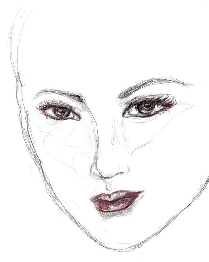
The story is about a superstar so stressed out by the pressures of her industry (and plastic surgery) that she skips in and out of time, and creates disarray of her “private” life as a result. The narrative itself has been living with me for some time. It first inception was in my little Twine experiment, Sound is a Spectrum, which is playable (but narratively incomplete) on this site.

Scar Tissue Interactive Game spreadsheet preview of dialogue

As also recommended by TOJam organizers, we came prepared with a list of programming priorities. I also created a spreadsheet of all of the game writing/dialogue and corresponding art assets. I created a Grooveshark playlist of the atmosphere that I was trying to set. On Google Drive, I defined the look of the game with reference images with consultation with Mikki, and then we all tried out these experiments at the jam itself! Eric went with an engine structured around 2D called Godot, currently in beta, as he wanted to test drive it at the jam.

Jam version of the game is available for download on itch.io, but is unfinished:
Scar Tissue as created at TOJam in Godot, programmed by Eric Roberts, designed by Tanya Kan

After the jam, I realized that I quite like the idea behind the game as a free release. As such, Mikki and I have continued to adapt the game. We changed the game engine from Godot to Unity, even though the languages are not compatible, because I am trying my hand at programming for the first time. I went with Unity because I really like the documentation and community that Unity has to address most of my questions, and I know that the Engine is flexible around the development needs of my future games. It was definitely an interesting learning curve to say the least, but not as much of an uphill climb as I feared! The other part is also that I can ask silly, simple questions of my Toronto friends about programming.


ScarTissue_Prev02

ScarTissue_Prev09

Now, for this new version, we have a lot more art assets to augment the story. Each platform is meant to have a different visual design to hint at the story inside each of its collectable dialogue boxes. Mikki designed and illustrated about 2/3rds of the platforms and they inspire me to have better design for those that I am in charge of! We tightened the art style so that it is more unified in the fashion illustration meets Dadaist hybrid. I am also playing around with the inclusion of some harder-to-reach platforms so that we get more narrative variety, and have some great friends to help out with the programming side!

ST_DMG_01_sm

Mikki and I were very kindly invited to present our game at Dames Making Games Speaker Social, where we shared some of our design considerations! It was a fantastic experience, where we received positive and constructive feedback. Thank you DMG and Bento Miso! Here’s the unabridged Powerpoint slides if anyone’s curious.

Update 2015: Scar Tissue is currently on hiatus.

Part of a series of 6, these illustrations pivoted on a fixed point, showing different degrees of a given space. Prismacolour Premier coloured pencils on Stonehenge, each 16″x24″ in size.

This is part of a series of illustrations for the mini-project ‘Narcissus’ that I am going to produce. There’s a number of styles and techniques that are utterly new to me with this little project, so I’ll try to enumerate many of these details.

This digital painting was first started on December 4th, just three days ago, and took altogether 8 to 9 hours to complete. Looking back, 8 hours is a very long time to dwell on one painting! However, some processes justified it. Progress shots follow after the final version, shown first:

First of all, it was the first time that I’m learning to use Autodesk’s Sketchbook Pro. The workflow is highly intuitive, which certainly helps, because I believe that if it was another CGI painting program, I may take an even longer time to produce a piece like this. From concept to the final product, I used Sketchbook; I have had made no other sketches to help ferment this idea. Second, I was actively aiming to go with a different visual style: To translate my style of colourful realism to something that is more like a fashion editorial illustration. I went with a monochromatic drawing with bold, curvy shapes and used colour only on the eyes and lips to make them pop.


I had a hard time at first because her facial structure is still fairly fleshed out like a realistic figure, although her eyes are scaled larger.

I scaled back her chin to make the proportions look more otherworldly. In order to try to achieve a more fashion editorial look, I completely restricted myself from using any sources. I had an idea in mind – big curls and these daring, neon eyes – and I started playing with shapes. After about 4 tries of getting the hairdo just right, I started in on different values.

From the lines going across her right eye in the previous drawing, I had realized that her forehead was too high, almost as though the hair was floating above her head. Started developing some wispy bangs that were much smaller than the bouncy curls, kind of like the smaller, non-flight feathers of a bird.

I knew that, much beyond the dramatic hair, I had wanted to go with avant-garde make-up from the beginning. This was something that I haven’t ever explored before. The reasons behind this might become more apparent when I create more pieces for the ‘Narcissus’ series. I must’ve struggled two hours with the proper “look” of the make-up, so that I am not merely making pretty dark shadows with the blue in the previous process shot. I did this Mardi-Gras decor first, then had my six hours sleep, woke up and played with a more edgy, Eye of Horus inspiration. Finally, I have found the dark, fantastical couture that I was aiming to achieve.

Progress shots and final for an interior architectural illustration, 2-point perspective. Graphite pencils. So far: 2B, F, HB, B2.

Prismacolour pencils illustration on grey Stonehenge paper, sized 16″x24″.

It’s supposed to mean something when I have a eureka moment, yet will I remember it as part of my identity in the tomorrows to come? This illustration “talks” about some of the key ideas that have cumulated at the forefront of one of my best years in university – where all of my four courses felt like they matter. My posture asks, with all of these wondrous thoughts of the world, where do we go from here?


An illustration from a skeleton in life drawing class. I’ll leave it up to you to pursue the irony.

Chalk pastel, Bristol board (we were being thrifty. I’m not sure why).


Dreams of small, sublime (sometimes frightful) things. First illustration in ink; Second in graphite pencils.

Here is a series of figurative drawings in varying styles and mediums.

First two were done with conte and pastels respectively, from live model, in 2006.

This one below was completed less than two weeks ago. It was drawn on capriciously beautiful textile recycled paper, which made the whole process very unforgiving, because any erasing would cause damage to the fibres. It also prevented me from layering as much as I tend to like to do, enabling me to only “mix” two colours much of the time. Thus, I chose bright tones that are close to the primary colours to generate flow and pop in the illustration.

The last two are hand drawings, using graphite and ink respectively.