
This is part of a series of illustrations for the mini-project ‘Narcissus’ that I am going to produce. There’s a number of styles and techniques that are utterly new to me with this little project, so I’ll try to enumerate many of these details.
This digital painting was first started on December 4th, just three days ago, and took altogether 8 to 9 hours to complete. Looking back, 8 hours is a very long time to dwell on one painting! However, some processes justified it. Progress shots follow after the final version, shown first:

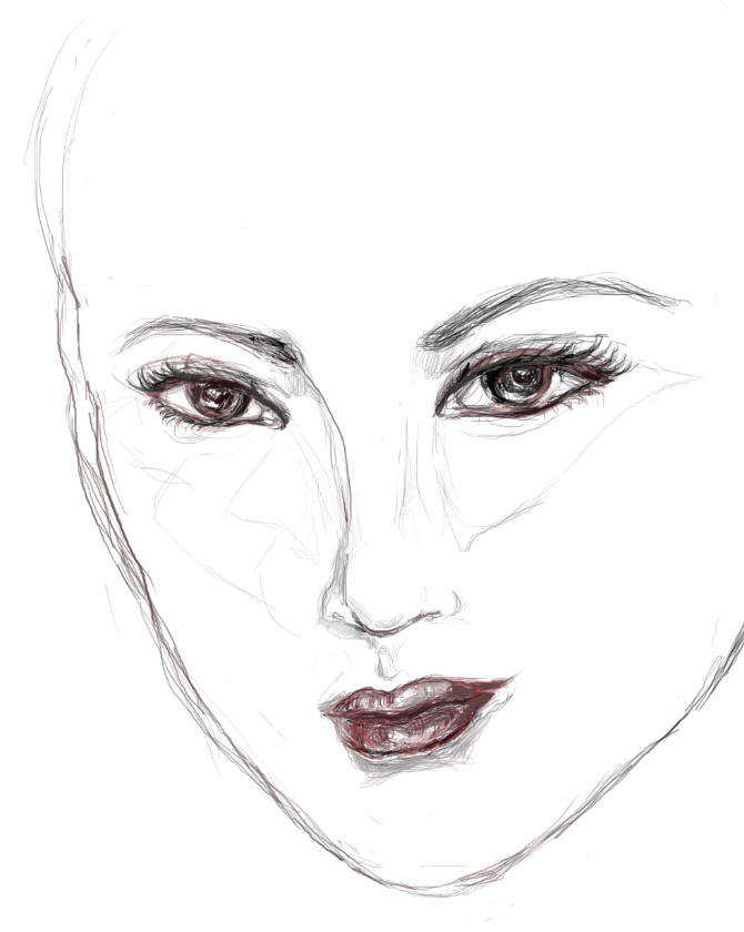
First of all, it was the first time that I’m learning to use Autodesk’s Sketchbook Pro. The workflow is highly intuitive, which certainly helps, because I believe that if it was another CGI painting program, I may take an even longer time to produce a piece like this. From concept to the final product, I used Sketchbook; I have had made no other sketches to help ferment this idea. Second, I was actively aiming to go with a different visual style: To translate my style of colourful realism to something that is more like a fashion editorial illustration. I went with a monochromatic drawing with bold, curvy shapes and used colour only on the eyes and lips to make them pop.

I had a hard time at first because her facial structure is still fairly fleshed out like a realistic figure, although her eyes are scaled larger.
 I scaled back her chin to make the proportions look more otherworldly. In order to try to achieve a more fashion editorial look, I completely restricted myself from using any sources. I had an idea in mind – big curls and these daring, neon eyes – and I started playing with shapes. After about 4 tries of getting the hairdo just right, I started in on different values.
 From the lines going across her right eye in the previous drawing, I had realized that her forehead was too high, almost as though the hair was floating above her head. Started developing some wispy bangs that were much smaller than the bouncy curls, kind of like the smaller, non-flight feathers of a bird.

I knew that, much beyond the dramatic hair, I had wanted to go with avant-garde make-up from the beginning. This was something that I haven’t ever explored before. The reasons behind this might become more apparent when I create more pieces for the ‘Narcissus’ series. I must’ve struggled two hours with the proper “look” of the make-up, so that I am not merely making pretty dark shadows with the blue in the previous process shot. I did this Mardi-Gras decor first, then had my six hours sleep, woke up and played with a more edgy, Eye of Horus inspiration. Finally, I have found the dark, fantastical couture that I was aiming to achieve.

")


")


")
")
")
")
")